Page 1 of 1
Saturday Afternoon WIP
Posted: 08 Sep 2009, 07:44
by neonbulbs
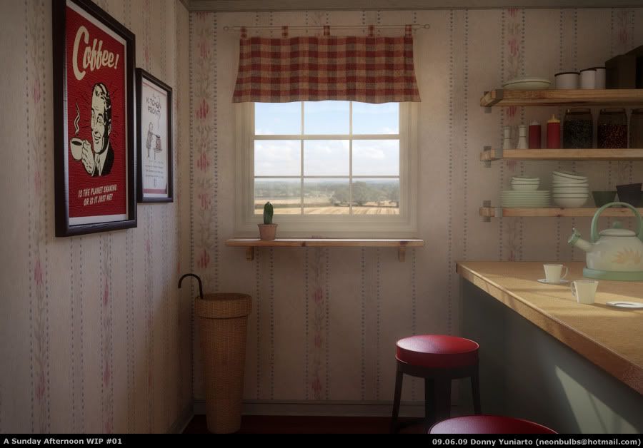
Hi guys. This one is one of my recent personal projects, been doing commercial works over the years and try to get my hands on the overall process from modelling, texturing, lighting, render and compose. This one is my first WIP. Feel free to give critics and comments, they are truly appreciated.
cheers...
Re: Saturday Afternoon WIP
Posted: 08 Sep 2009, 13:50
by Mootzoid
My oh my, what a nice work!
You want critics? Sorry, but you'll have to do worse than that to get critics

cheers!
Eric
Re: Saturday Afternoon WIP
Posted: 08 Sep 2009, 22:31
by brtaylor
Hello neonbulbs
Great work if I might add. Maybe the flower pot in the window, and the saucer on the counter-top maybe a tab to small. Not not really a issue the lighting is great. I notice the volumetric in the window lighting casting very subtle.
Bobby
Re: Saturday Afternoon WIP
Posted: 08 Sep 2009, 22:31
by shushens
I could point out a technical thing or two, but I won't, because as soon as I looked at it, it reminded me of "The Postman Always Rings Twice" starring Jack Nicholson and Jessica Lange (the Lana Turner one did not have colour, of course...). What I value way over technicality is the mood, and you have excelled in that department. So, nothing else to say.
Keep up the good work!
Re: Saturday Afternoon WIP
Posted: 12 Sep 2009, 16:05
by neonbulbs
@shushens, @Mootzoid: Thank you for your kind words. I appreciate it.
@brtaylor : Thank you for your suggestion. I noticed that too, and have made some scaling adjustments to pots, plates and cups.
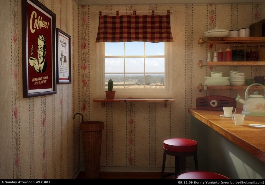
This is the final version of the image that I working on. I've made changes to the lighting and also added up a classic radio just to make to mood a bit classic.
Comments and critics are welcome...
Cheers
Re: Saturday Afternoon WIP
Posted: 13 Sep 2009, 03:22
by shushens
You are welcome!
If you really want criticism, there are a few things I can see.
1, The Coffee ad is 100% non-reflective, which is not natural. Usually those things do not have a glass covering, but the paper must be a tiny bit glossy.
2, The seats on the barstools are too perfect to be real. They need more wrinkles, a little weathering by the corner edges.
3, The pot with the cactus is too small and there should be some scattering on the pot. It's looking like it's a square object. But it is not. So some light should bleed in by the boundaries.
4, The plates on the bar are too thin. They're almost zero-thickness.
5, The window-curtain is not enough translucent. It looks like it's made of some thick fabric. In that case you have to use some noise texture to drive the translucency, because it won't be uniform like it could be for fine silk.